Tuesday, October 20, 2015

Project #2 - Design Sprints Part 2

Similar to the last post, we now focus on "Ration Ale" and apply the Design Thinking Tools:
  • The OPV
  • The 180 
  • Mind Maps
  • Zoom
  • 50 Questions
  • Idea Maps
This product was also included on the diagram of overall design considerations from the last post, and looks to reach the same target audience as well:


 Based on this information, we can then consider the OPV diagram for Ration Ale:

The next technique, 180 degree thinking, was also applied to the product including some attempts to invert the common ideology that "bigger is better":
Relationship explorations then begin next with a Mind Map of the product:
Abstracting the layers of the beer was also possible using the Zoom method:

 Then again, a textual approach to probing the product occurs in the 50 Questions task:
Ration Ale - 50 Questions:
1.) Do alcohol laws improve our odds of reaching only our target audience of 19+?
2.) If not, how do we discourage underage drinking of our product?
3.) Is 7.5% too strong for novices to drinking?
4.) If so, will the small sized bottles decrease binge drinking issues?
5.) Otherwise, how else can we decrease binge drinking?
6.) What is the cost of having smart serve and bartender trained staff?
7.) Does this cause issues with letting younger customers into the cafe?
8.) If so, is this possibly a benefit to creating an adult-focused atmosphere?
9.) Should we stay open and sell alcohol until the latest time legally allowed?
10.) Otherwise, should we market our product to bars open after our closing time?
11.) Should we sell the product in the BEER store and LCBO?
12.) Is the strong taste of the beer likely to turn away younger customers?
13.) If so, should we continue with the stronger beer?
14.) As customers must drink on the premises, should we continue with bottles?
15.) Is a keg and beer tap format more environmentally friendly for serving the ale?
16.) If so, should we switch to this method and use glasses that we clean?
17.) Will the beer taste the same from a keg and tap than from a bottle?
18.) If better than bottled taste, should we not sell it at BEER and LCBO stores?
19.) Otherwise, will customers notice a difference in taste?
20.) Is there a new way to bottle and store the ale that preserves flavor?
21.) Or is the backlash of not selling bottles of more importance to customers?
22.) Is it easier to transit kegs than bottles to the store?
23.) Are bottles more fragile during shipping from the brewery?
24.) Are cans a viable alternative for lowering odds of breakage in shipping?
25.) Will customers accept canned Ration Ale?
26.) If not, and if kegs are rejected as well, should bottles have a unique shape?
27.) Will customers want the bottles to fit in their existing beer sleeves?
28.) Should bottles use colored glass or clear glass?
29.) Should bottles use paper labels, or should we print directly on the glass?
30.) Should bottle caps be twist-off or pop-off?
31.) Should the empty bottles be very light or heavy?
32.) If sold in BEER and LCBO stores, should it be sold in cases of 4 or 12?
33.) How does our target audience perceive alcohol in general?
34.) Would binge drinkers using our product affect its public image as a brand?
35.) What methods of advertising help promote Ration Ale customers as professionals?
36.) Should the label be easily removable for recycling?
37.) If so, how much would this cost to attach rather than traditional strong glues?
38.) Should natural dyes be used to color the labels?
39.) What about the cap, should it be printed on a label or directly on the metal?
40.) Should the cap have soft edges, or traditional pointed edges?
41.) How do we ensure the bottle caps are recycled rather than thrown out?
42.) Does our target audience care about recycling?
43.) If so, does a positive environmental image boost sales?
44.) Is Ration Ale considered a specialty drink by our customers?
45.) If so, how do we maintain this impression? how do we encourage repeat business?
46.) Would a special offer on pitchers of Ration Ale increase weekday business?
47.) Would the target audience perceive such an idea as damaging to the brand image?
48.) Should Ration Ale promote on television, web, and print adverts?
49.) If not, should the cafe run promotional events to advertise the beer?
50.) Can we afford to run such events frequently?
Finally, an Idea Map can be drawn for the product to expose relationships between a variety of aspects of the product:

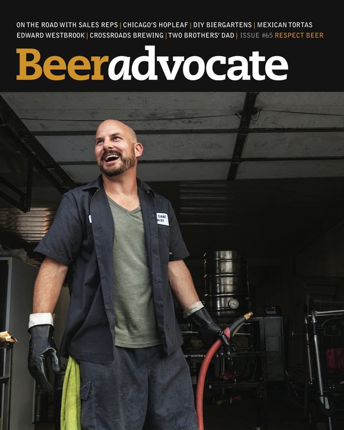
This product can be harder to market due to the extremes of opinion on alcohol that occur in the general public. Whether by past experiences or personal beliefs, a negative viewpoint on the alcoholic beverage may be more likely to form than for the Lift Tea products.

Combating this would be to add emphasis, via colors and fonts, on the product being "traditional" or "classic" and marketing it as the choice drink of "professionals" to be consumed slowly rather than by binge drinking.

Each customer becomes a representative of the product through their actions, if publicized, and so the strength of the alcohol content also increases odds of an indecent action being performed by someone who is intoxicated from it.

Successful marketing will therefore imply that the drink is a specialty occasion and insist on "smart consumption", and so despite the added challenges would still be a viable product for the cafe.

Project #2 - Design Sprints Part 1

The Latte's & Lager's cafe/bar is the hypothetical new location in Hamilton that serves products "Lift Tea" and "Ration Ale" which we are to think of graphic designs for using Design Thinking Tools including:
  • The OPV
  • The 180 
  • Mind Maps
  • Zoom
  • 50 Questions
  • Idea Maps

First however, is the consideration of branding for the cafe itself, which has been planned lightly on paper:


Then, analysis of the products themselves can be done based on ideas generated when thinking about the cafe:

With these ideas and rough imagery depictions in mind, we can then proceed to use the Design Thinking Tools to expand on concepts and find new ways of thinking about the products.

This post will focus on Lift Tea, described as "a new line of gourmet, organic teas" with "fair-trade sourced" ingredients and both caffeinated and decaf teas in the product line.

The first design tool I had used with this was the OPV or Other Points of View, in order to look at the product from different perspectives:
Then, the 180 degree thinking tool encouraged using seemingly counter-intuitive thought processes to approach the product:
The next in the tools suggested was the Mind Map, which was useful for forming a diagram of the relationships generated from the brand:

Next, a Zoom diagram would express layers of abstraction from the Lift Tea series:

Less graphically, we could also run theoretical design experiments by asking 50 Questions about the product:
Lift Tea - 50 Questions:
1.) Does weather affect sales of hot drinks (eg: tea)?
2.) Does tea have any positive health effects?
3.) Does our target audience care about health?
4.) Does our target audience prefer decaf?
5.) Is caffeine in tea enough to boost energy?
6.) Can we use that as a selling point?
7.) Will graphic "up arrows" be too corny in branding?
8.) What about sky blues, further emphasizing "upward"
9.) Is tea a popular drink amoung our target audience?
10.) If not, how can we increase consumption?
11.) Will being organic increase sales or public image?
12.) Will being fair-trade increase sales or public image?
13.) Does drinking Lift Tea affect the self image of a customer?
14.) Should Lift Tea have a unique aftertaste, or none at all?
15.) Is the use of organic, fair-trade ingredients much more costly?
16.) How much mark-up should Lift Tea make?
17.) Would donating part of the proceeds to charity increase public image?
18.) Would a high price decrease sales, or increase profile of the product?
19.) Is keeping trendy important in the continued sales of the product?
20.) How much advertising should be used to increase sales?
21.) What kinds of advertising should we use to reach the target audience?
22.) What do we do with nearly-expired tea bags if they do not sell?
23.) Will we sell tea bags for use outside of the cafe?
24.) Will we give free tea bag samples away to increase awareness?
25.) Should we run a rewards card for repeat tea customers?
26.) Should purchasing tea be part of a greater good?
27.) If so, how do we demonstrate this to customers?
28.) If customers do not care about this, should we change our vision?
29.) Is break-even pricing an option during intial release?
30.) If so, how will we explain the price increase after establishing the brand?
31.) How will we approach social media of Lift Tea?
32.) Should we encourage recycling with rewards for returned tea bags?
33.) Can used tea bags be used in compost?
34.) Can we find greener ways of shipping the tea to Hamilton?
35.) Is being green still an impressive feature of a product?
36.) If not, what is a new way to get customers excited?
37.) How do we ensure that our target audience are the primary customers?
38.) Is this in the way we brand the tea bags, the pricing, or the advertising?
39.) Should high quality print and material be used for the bags?
40.) Would this improve the brand image?
41.) Is increased packaging quality directly related to increased sales?
42.) What size should the cups be? Does this affect the size tea bags should be?
43.) Is using more than one tea-bag per cup wasteful?
44.) Does this negatively affect customer impressions of the brand?
45.) Does producing both decaf and caffeinated tea bags seem wasteful?
46.) If so, are there health reasons for the cancellation of caffeinated tea?
47.) Will health reasons decrease the backlash from cancelling caffeinated tea?
48.) If not, should we avoid releasing this tea in the first place?
49.) What if that draws complaints?
50.) Would adding a caffeinated tea later on seem like meeting customer demands?

The final graphical technique we learned was the Idea Map, where links form from a central point to different concepts and facets of the product:

Ultimately, the goal of Lift Tea based on these ideas is to produce a tea that appears both healthy and humanitarian to consume, thus becoming much more than a drink to consume but rather an action customers can take to improve the lives of others.

Similar to the cafe itself, the target audience is both the students who may opt for caffeinated tea to boost energy levels, and the older urban professionals who prefer to drink high quality teas. Both could drink decaf tea if sleep is preferred to the energy of caffeine.

Sunday, October 4, 2015

Project #1 - Part D: Bell Gothic Text Layout

This task was similar to the last one as were tasked to sketch different concepts for layout of a text using our assigned font and then produce two of these ideas digitally in Illustrator. The text we were assigned to use for this part of the project was an excerpt from Girlfriend in a Coma by Douglas Coupland.

 "Would I do it the same way all over again? Absolutely - because I learned something along the way. Most people don't learn things along the way. Or if they do, they conveniently forget those things when it suits their need. Most people, given a second chance, fuck it up completely. It's one of those laws of the universe that you can't shake. People, I have noticed, only seem to learn once they get their third chance- after losing and wasting vast sums of time, money, youth, and energy you name it. But still they learn, which is the better thing in the end."

Arrangement of the words in a text can have a very powerful effect in changing the meaning conveyed from a work, from the micro scale of per-word emphasis to a macro scale which shapes the overall flow of information to the reader. Finally, similar to how speech will have pauses and interruptions, text layout work to this effect within the space of a page.


Reading the excerpt I had felt there were many opportunities to draw attention to specific sentences and words in ways that improve the communication power of the text. Although it appears to be written from first person perspective of a single character I had also felt that the text could be represented as a conversation between two conflicting opinions held within one mind that converge as a final outcome "in the end".


I then started the hand drawn sketches, which for the most part are straight lines with a few words to mark where in the text to begin from for each line or segment. Adjusting spacing between letters, words, and lines on paper proved fairly challenging and so was exaggerated where possible to demonstrate. The final sketches turned out like this:


Of these drawings B3 and C4 felt most interesting, where B3 would represent two opposing ideas converging as one in the center at the bottom, and C4 would seem like a standard iPhone conversation on the left side, and a slow powerful final message along the right side. Both of these ideas were influential in the final digital designs as shown here:


The first of the two designs took a slightly different approach to B3 due to the way the text fit within the 5 inch by 5 inch space. Instead of a left-vs-right layout there is a flow where the text is pulled more to one side or the other with more positive thought ending on the right side and a more negative thought process starting very far towards the left side. The final line decreases the speed of reading by spreading the letters out to add emphasis, and is located towards the center of the page to balance the two extremes.

The second design follows the idea of C4, and instead uses the entire space for a single thread of left-vs-right commentary, similar to texting on a phone. Expressing the commonality of ideas is done here instead at the end of the piece by the left and right side finishing the sentence of the other. Again, isolating "in the end" adds emphasis.

Monday, September 28, 2015

Project #1 - Part C: Bell Gothic Word Visualization

Visually communicating the meaning of a word can be difficult, especially when the word is a noun rather than a description of an action or appearance. For this part of the project, we were tasked with designing a visual design that communicates word meanings through pure use of the font we had previously researched.

Aside from predetermined word lists, as well as font and color restrictions, we were free to experiment with our designs including changes to position, rotation, scale, negative and positive space, and opacity within a square frame.

The two words I had chosen for this task were Symbiosis and Transition, after which the hand drawn sketches began.

Very rough brainstorming sketches

The first designs that began to emerge from my mind were for symbiosis, and so the drawings at A1 through D2 were experiments with different ways to display its meaning. The first meaning of the word that came to mind was a parasitic relationship, where one living organism survives by consuming its host, and so the A1 drawing was planned as a letter 's' acting as host and 'ymbiosis' as the parasite. The drawing B1 is a continuation of this meaning of the word with more letters as hosts and single letters as parasite.

Other designs that came to mind were for the more peaceful forms of symbiosis, such as where two organisms can live in harmony. This was difficult to imagine a simple visualization for, and so C1 was a weaker design where letters of one word are shared with the next word. This idea was also used again in D2 in another way that was again not strong enough to convey the message.

Another image that came to mind with this definition was based on the relationship between sharks and small fish which swim under them. This lead to a depiction of a shark using letters to form the shark, the small fish, and the seaweed at the bottom of the frame. This idea stuck with me and so I tried a modified version of it in B2.

The designs in A2 and C2 are based on other visual images, where a handshake vector graphic inspired the first and the second was similar to the well known symbol for recycling. These designs would focus more on using text to fill a shape, in an attempt to stray from the more minimalist designs that did not produce favorable results.

The strongest ideas for symbiosis were therefore A1, for its use of negative space to demonstrate that the parasite is eating away at the host, and B2 for the graphic way of representing the shark purely using text characters rather than filling a shape with smaller text.

The next group of designs were for the word transition, and were also difficult to imagine in the form of a still image. Initial designs such as A3, B3, B4, A5, and B5 were based on the idea of the text transitioning between different rotations, scales, and positions but were very chaotic and did not communicate the meaning well. A similar issue occurred in A4 which, although it filled the space well, did not translate well into the meaning of the word.

Other designs that weren't quite strong enough were opacity experiments D3, C4 and D5, as well as experiments in scale for C3 and C4. With the other ideas eliminated, the final layout designs for transition were ultimately based on B4 and C3, due to their minimalism and use of space.


The initial designs were all drawn on a single A4 sheet and so they could only communicate the most modest of details, but elements from many of the small sketches can be seen in each of the final designs.

Thursday, September 17, 2015

Project #1 Part A - Research: Bell Gothic Font

Bell Gothic infographic (Cargocollective.com, n.d.)

As a part of the Bell family typeface, which was originally cut by Richard Austin for John Bell in 1788, the newer Bell Gothic font was designed in 1937 by Chauncey H. Griffith (Linotype.com, n.d.). This typeface was created for, and owned by, AT&T for the printing of phone numbers in their telephone directories, and is classified as both a Sans Serif and Gothic font (TOL, 2009). In original use of the typeface the Bell Gothic Bold and Light font weights were used together, bold for the names of subscribers and light for setting addresses (Sherman, n.d.).

The typeface had been designed according to the technology of the time, including the Linotype machine and letterpress, but did not perform well with the new technology which “was being done photographically with Cathode Ray Typesetting (CRT), and the printing done on high-speed offset lithography presses” (Sherman, n.d.). This therefore would cause issues in lettering including broken letterforms, lightened strokes, and “sometimes eroding completely at the intersections of straight and curved strokes” (Sherman, n.d.). Hence, this font was eventually superseded by the Bell Centennial typeface designed by Matthew Carter which was intended to work with the newer technologies (Sherman, n.d.).

The current owners of all forms of the Bell Gothic typeface is Linotype who license Bell Gothic Light, Bell Gothic Bold, and Bell Gothic Black fonts for use in forms of desktop, website, mobile app, e-book, and server (Linotype.com, n.d.). The pricing of the fonts varies for each form, depending on variables such as the number of desktops, website views, app installs, versions of e-book, and server CPU cores, as well as the language or format the customer wishes to purchase (Linotype.com, n.d.).

In modern use, Bell Gothic continues to appear in a variety of advertisements, magazines, book covers, and more, as seen in example images from the publicly curated gallery from the Fonts In Use website (Fontsinuse.com, n.d.):

Beer Advocate Magazine - 2011 (Fontsinuse.com, n.d.)
Whipps Childers Communications (Fontsinuse.com, n.d.)

 
Oliver Jeffers: Neither Here Nor There - 2012 (Fontsinuse.com, n.d.)

 
Attitude Magazine - 2010 (Fontsinuse.com, n.d.)

 
Who Will Run the Frog Hospital? by Lorrie Moore - 1995 (Fontsinuse.com, n.d.)

References

Cargocollective.com, (n.d.). Bell Gothic the Typeface - Stuff by Stef. Retrieved 17 September 2015, from http://cargocollective.com/stuffbystef/Bell-Gothic-the-Typeface
Fontsinuse.com. (n.d.). Bell Gothic in use - Fonts In Use. Retrieved 17 September 2015, from http://fontsinuse.com/typefaces/3784/bell-gothic
Linotype.com. (n.d.). Bell Gothic font family - Linotype.com. Retrieved 17 September 2015, from http://www.linotype.com/1245683/BellGothic-family.html?site=details
Sherman, N. (n.d.). Bell Centennial. Nicksherman.com. Retrieved 17 September 2015, from http://nicksherman.com/articles/bellCentennial.html
TOL, M. (2009). Typedia: Bell Gothic. Typedia.com. Retrieved 17 September 2015, from http://typedia.com/explore/typeface/bell-gothic/

Monday, September 14, 2015

Blog Assignment #1 Reflecting on Design in Everyday Life


A graphic design that works well at communicating a message is the bike parking sign at Allegra, a print and design store situated near downtown Hamilton. The most noticeable part of the graphic is the simple imagery which instead relies on many denotative and connotative meanings to communicate its message in a way that resonates with cyclists and the general public.


Looking at the initial denotative meaning of this design there is a combination of overt mentions of bicycles in the text as well as imagery of a bike in the typography and background, the latter of which occupies the largest amount of space in the center of the graphic. There is also a contrast between the green text and black background at the top and between the white text and green shape at the bottom of the design which makes the text easy to read in both locations. This strengthens the design due to the simple overt meanings and appearances.


Connotatively there are also a variety of meanings within the imagery but the most obvious of which would be the use of green. This is to build on a pre-existing belief that a bicycle, the signifier, is good for the environment or quite literally “green”, the signified, and thus is the formation of a “sign” in semiotics terms. This intelligent use of the existing cultural ideology is also very important in the performance of the design.

In addition, this lends power to Allegra by communicating that they are also helping the environment through the inclusion of their logo at the bottom. They further use an Internet hashtag implying that the company is “bike friendly” and hence appear active in promoting and supporting cycling outside of their own business to the general public. These strengths in design both improve the public image of the company directly.

However, outside of the design, there is also prominence and power given by its placement directly in front of the store with no obstructions from both the front and back which makes it easily viewed by pedestrians, cyclists, and vehicle traffic. Hence, and working together with the strengths of the graphic, there is a strong message communicated that is both deliberate and beneficial to Allegra which is also a reflection of the quality of the design itself.