"Would I do it the same way all over again? Absolutely - because I learned something along the way. Most people don't learn things along the way. Or if they do, they conveniently forget those things when it suits their need. Most people, given a second chance, fuck it up completely. It's one of those laws of the universe that you can't shake. People, I have noticed, only seem to learn once they get their third chance- after losing and wasting vast sums of time, money, youth, and energy you name it. But still they learn, which is the better thing in the end."
Arrangement of the words in a text can have a very powerful effect in changing the meaning conveyed from a work, from the micro scale of per-word emphasis to a macro scale which shapes the overall flow of information to the reader. Finally, similar to how speech will have pauses and interruptions, text layout work to this effect within the space of a page.
Reading the excerpt I had felt there were many opportunities to draw attention to specific sentences and words in ways that improve the communication power of the text. Although it appears to be written from first person perspective of a single character I had also felt that the text could be represented as a conversation between two conflicting opinions held within one mind that converge as a final outcome "in the end".
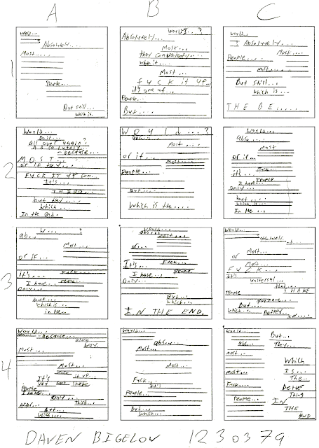
I then started the hand drawn sketches, which for the most part are straight lines with a few words to mark where in the text to begin from for each line or segment. Adjusting spacing between letters, words, and lines on paper proved fairly challenging and so was exaggerated where possible to demonstrate. The final sketches turned out like this:
Of these drawings B3 and C4 felt most interesting, where B3 would represent two opposing ideas converging as one in the center at the bottom, and C4 would seem like a standard iPhone conversation on the left side, and a slow powerful final message along the right side. Both of these ideas were influential in the final digital designs as shown here:
The first of the two designs took a slightly different approach to B3 due to the way the text fit within the 5 inch by 5 inch space. Instead of a left-vs-right layout there is a flow where the text is pulled more to one side or the other with more positive thought ending on the right side and a more negative thought process starting very far towards the left side. The final line decreases the speed of reading by spreading the letters out to add emphasis, and is located towards the center of the page to balance the two extremes.
The second design follows the idea of C4, and instead uses the entire space for a single thread of left-vs-right commentary, similar to texting on a phone. Expressing the commonality of ideas is done here instead at the end of the piece by the left and right side finishing the sentence of the other. Again, isolating "in the end" adds emphasis.


No comments:
Post a Comment